PixelNamics designs and builds Shopify stores for entrepreneurs. Its own website made people dig for the services it sells. They were buried under long blocks of text, one plan showed up on two different pages, and nothing told you what to do next. I redesigned the site so a new visitor could find the right service and book a call.
Company
PixelNamics
Role
Product Design Intern
Timeline
Jan–Mar 2024
The problem
Visitors came to hire PixelNamics, but they couldn’t find what it sells.
What I designed
A new site structure and four redesigned pages: home, services, about and the affiliate program.
My role
I ran the research and redesigned the site, working directly with the founder.
Where it landed
The redesign went live on the store. After the relaunch, total sales rose 172%, store sessions rose 139% and returning customers went up 7%.
01 · The problem
THE STOREFRONT
People came to hire PixelNamics, then got lost looking for what it sells.
PixelNamics is a small studio run by its founder, Veronica Lopez. It builds custom Shopify stores, keeps them running on monthly retainer plans, and takes on one-time fixes. The website is where new clients are supposed to find a service and get in touch.
When I reviewed the old site, I kept running into the same problems. Here is what a first visit looked like.
ARRIVE
The homepage opens with general info. The services sit far below it.
SCROLL
Service names read like long descriptions, so they blur together.
BACKTRACK
The retainer plan shows up on two different pages.
LEAVE
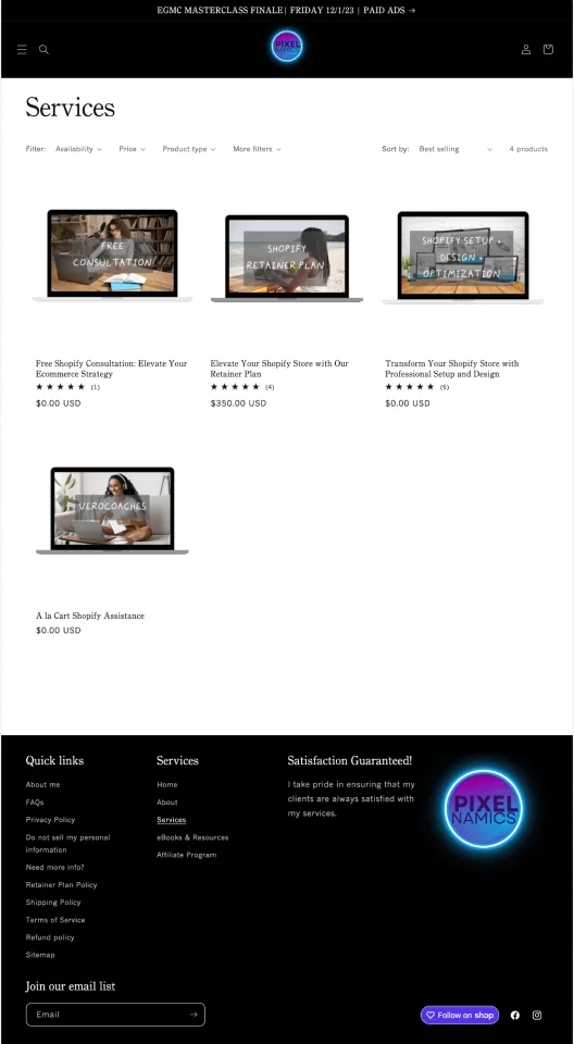
Some prices say $0, and nothing says what step comes next.
Pieced together from my review of the old site.
The site I started with
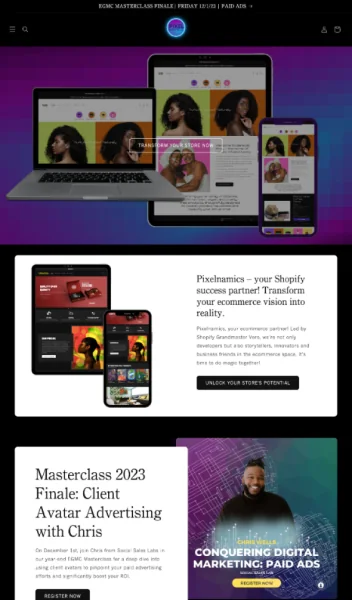
Home

Portfolio
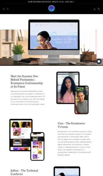
About
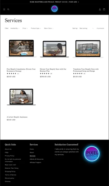
Services
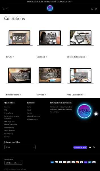
Collections
Five pages, each a long scroll of text and device mockups.
For a studio that promises entrepreneurs an easy online store, its own site was hard to get through.
The question I set out to answer
How might we help entrepreneurs find the right service quickly and feel sure about reaching out?
02 · Research
THE SHOPPERS
I started with the founder, then looked at the site through her clients’ eyes.
I interviewed Veronica to learn what the business needed most. Then I reviewed the old site against common usability rules, compared it with other Shopify agencies, and wrote three personas based on the clients PixelNamics serves.
How I worked
01
Research
Stakeholder interview
Heuristic analysis
Competitive analysis
Personas
02
Ideation
Site mapping
UI sketches
Low-fidelity wireframes
03
Design
Visual design
High-fidelity mockups
04
Evaluation
Prototype testing
Review
05
Documentation
What I wanted to learn
01
Find the pain points in the current site, especially around finding services and getting around.
02
Understand what visitors expect from a simpler, easier site.
03
Study competitor sites for how they highlight services, build trust and get people to act.
04
Check design decisions against real data, so the redesign serves both visitors and the business.
05
Find ways to cut mental effort and make the site structure clearer.
What the founder told me
Veronica Lopez, founder
“We want our users to feel that we have their best interest at heart, and that our services will help them achieve their eCommerce goals.”
Veronica wanted the retainer plans front and center. That became the first thing the redesign had to deliver.
Veronica Lopez, founder
“We would like to mainly highlight the retainer plans, that is our main focus. As well as the one time site development, and the specific task renovation.”
Heuristic review
I checked the old site against Nielsen’s usability heuristics and rated how serious each issue was.
Competitive analysis
I compared five other Shopify agencies to see what works for them and what gets in the way.
WORTH BORROWING
Build trust early
Show the full range of skills
Make calls to action easy to reach
Explain each service clearly
Keep the interface clean
Break up big blocks of text
Repeat the call to action across sections
Show a timeline of the process
WORTH AVOIDING
No call to action on the homepage
No single page to browse every service
Too much text
Language that doesn’t motivate
Too many calls to action on one screen
Buttons that lead to an unexpected form
Three personas
The personas were a first-time store owner, an owner whose store needed fixing, and a busy owner who wanted it all handled. Each wanted something different, and all three hit the same walls.
Where all three got stuck
BURIED
The services sat far down the homepage, under lower-priority information.
REPEATED
The retainer plan showed up on two pages, so the structure stopped making sense.
NO NEXT STEP
While browsing or signing up, visitors were never told what step they were on.
03 · Key insight
THE FLOOR PLAN
The site didn’t need a new coat of paint. It needed a new floor plan.
Veronica wanted visitors to see the retainer plans first, then one-time store builds and smaller tasks. The old homepage put them near the bottom. Each persona came with a different goal, but all three needed the same first thing: to see what PixelNamics offers.
What visitors came for
SERVICES
and how to start
What the homepage led with
THE REST
general info first
So the goal changed. Before touching color or type, I had to put things in the order visitors need them.
Four goals for the redesign
04 · What to build
THE BLUEPRINT
Three jobs the site had to do.
I turned the personas into three simple jobs, each written from the visitor’s point of view.
BEFORE
lots of scrolling
Land on the homepage
Scroll past general info
Find a plan on one page
Find it again on another
Guess the real price
AFTER
one clear path
See the services up top
Compare them on one page
Follow three simple steps
Book a free call
Then I mapped the new structure and sketched each page before designing anything.
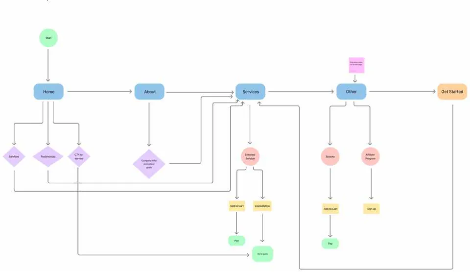
The new site map, from the homepage to booking a call.
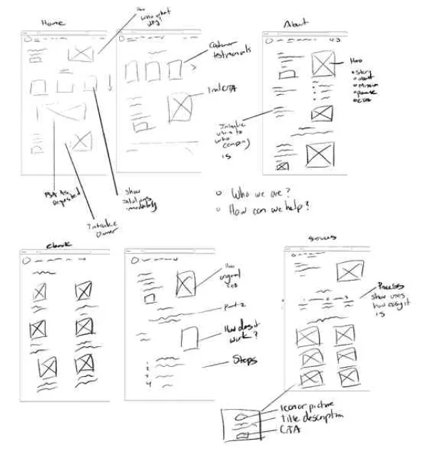
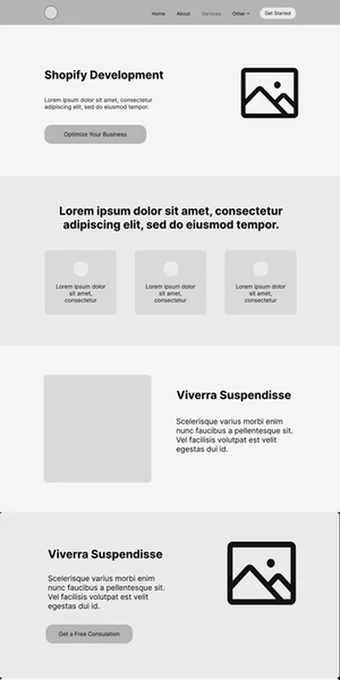
Early page sketches, and the low-fidelity homepage wireframe that came out of them.
05 · Design decisions
THE MAKEOVER
Four design decisions, and the trade-offs behind them.
Each decision meant giving something up. Here’s what I chose, and why. The screens are from the live redesign.
DECISION 1
Put the services on the homepage.
The trade-off
Leading with services meant cutting back the intro and company story that used to open the page.
What I chose
Three core services sit right under the hero, each with a short name, one line and a link. The story moved further down.
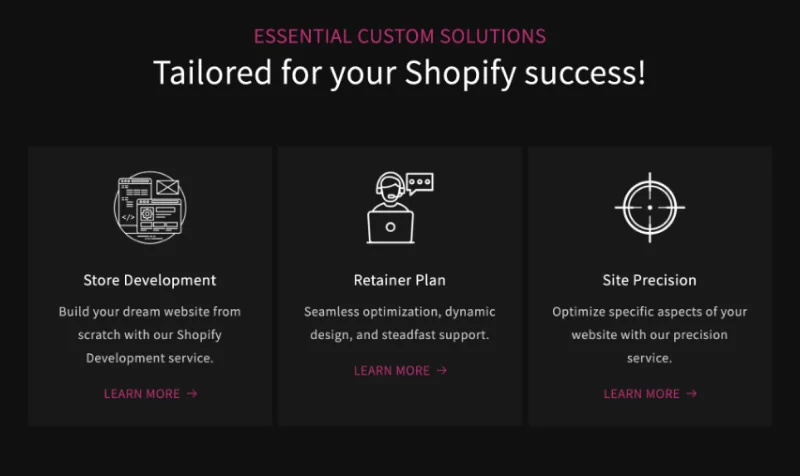
DECISION 2
Rename services in plain words.
The trade-off
Short names lose some of the detail the old long titles carried.
What I chose
Names like Store Development and Retainer Plan, with one sentence each. The full detail lives on the services page.
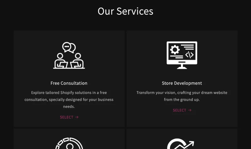
DECISION 3
Show the steps up front.
The trade-off
An extra section makes the services page longer.
What I chose
An “As easy as 1-2-3” strip at the top: book a free consultation, choose a plan, get started. People know what happens before they commit.
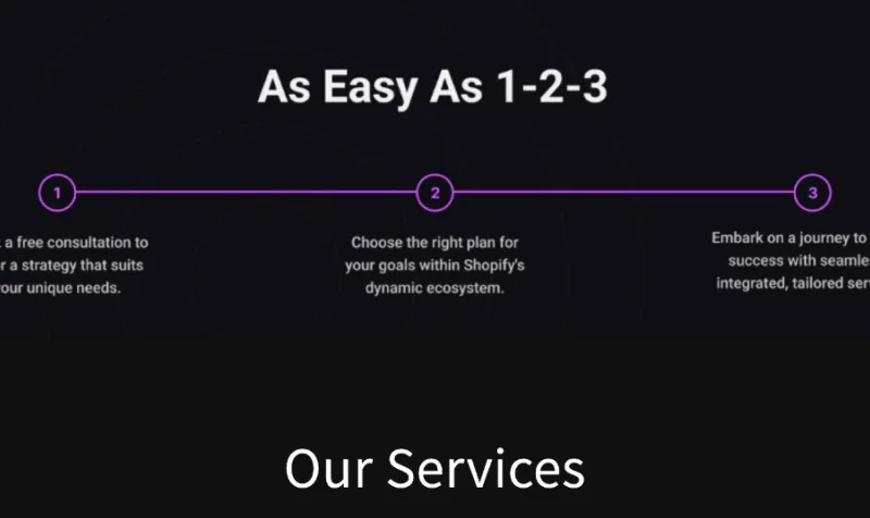
DECISION 4
Let real people build the trust.
The trade-off
A founder video and client reviews take up space that could have held more services.
What I chose
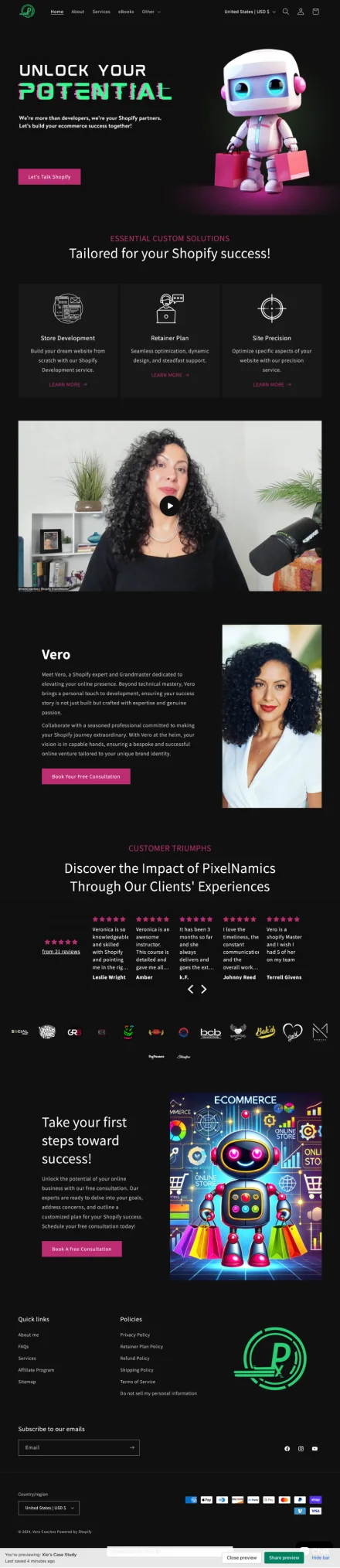
A video of Vero, the founder, plus client reviews on the homepage, so new visitors see the real people behind the studio.

Before and after
The same studio, with a new floor plan.
Homepage
BEFORE
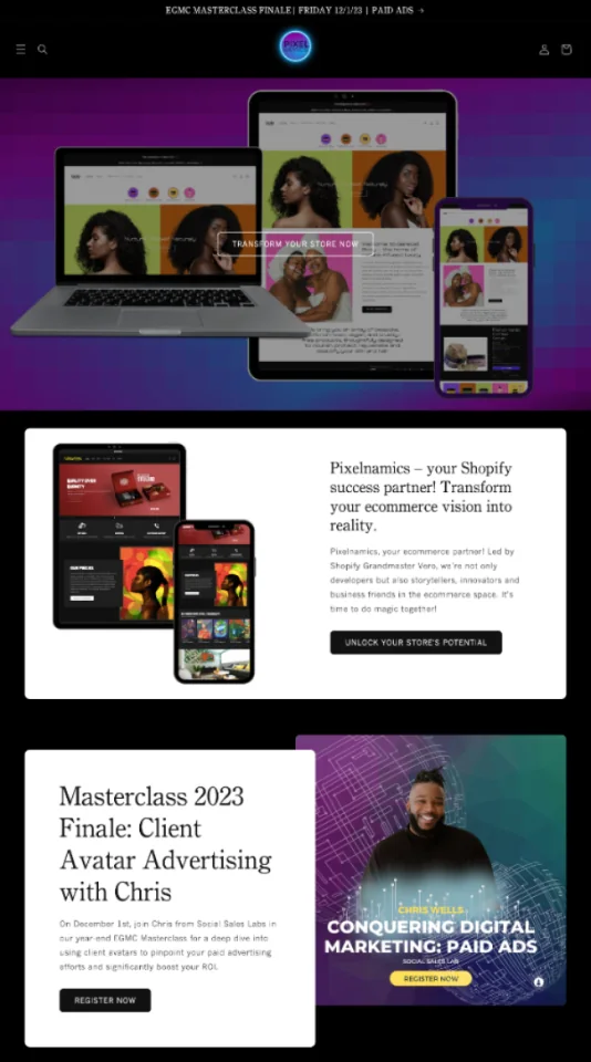
AFTER
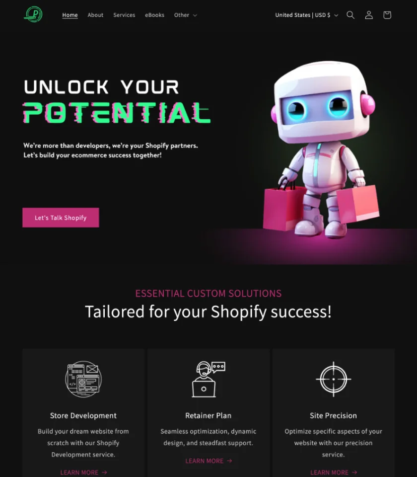
The old homepage opened with mockups and long copy. The new one puts the services right under the hero.
Services page
BEFORE
AFTER
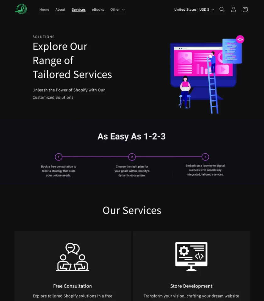
The old services page was a grid of product cards with $0 prices. The new one shows the steps, then every service in one place.
Everything I changed
01
Restructured the navigation so key pages are easy to reach.
02
Put the retainer plans and consultations on the homepage.
03
Organized the content in a logical order.
04
Used a minimal layout with a clear visual hierarchy.
05
Made every page responsive.
06
Made calls to action bolder and placed them where people look.
07
Added client reviews and case studies to build trust.
08
Cut service descriptions down to the essentials.
09
Matched every page to the PixelNamics brand.
Visual design
I kept the brand’s dark look and stripped out the extra detail so the content leads. Assistant is sleek, easy to read and feels forward-thinking. Roboto backs it up in smaller text.
The final design
Four pages, live on the store: home, services, about and the affiliate program.
Home
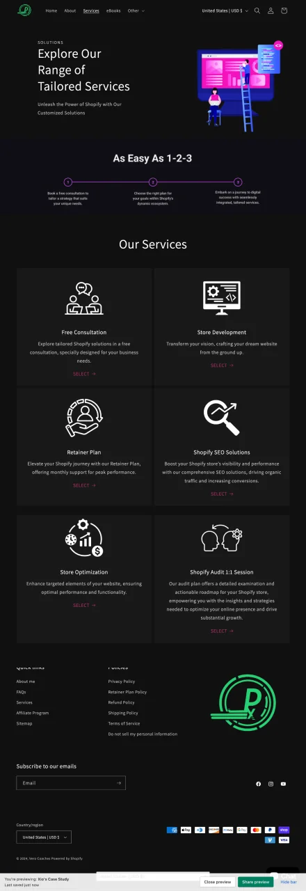
Services
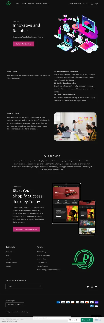
About
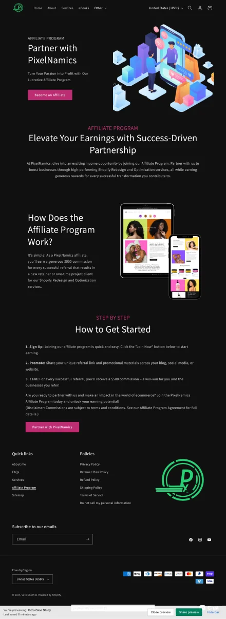
Partner with PixelNamics
06 · Outcome
GRAND REOPENING
Open for business: from digging around to getting started.
Before launch, I ran a usability test with five people. They did four tasks on the original site, then the same tasks on the new design in a Shopify preview.
Here’s how long each task took.
OLD SITE
REDESIGN
Find the retainer plans
70 to 180 seconds
→
35 to 90 seconds
Sign up for the newsletter
90 to 200 seconds
→
45 to 100 seconds
Find the blog
80 to 200 seconds
→
40 to 100 seconds
Complete a purchase
120 to 240 seconds
→
60 to 120 seconds
Every task took about half as long. After the relaunch, total sales rose 172%, store sessions rose 139% and returning customers went up 7%.
What I learned
01
A clear hierarchy cut the effort in half.
Restructuring the navigation into a clear hierarchy cut the time people needed for each task almost in half. The colors came later.
02
Visual cohesion builds trust.
Matching colors, type and spacing on every page made a small studio feel dependable.
03
Business goals and user behavior can line up.
Putting the retainer plans first helped Veronica’s business and gave visitors the answer they came for.