College can be lonely, and studying alone makes it easy to lose steam. Hyve is a mobile study app that connects students taking the same classes and turns their progress into something they can see, share and climb. I took it from a student survey to a clickable prototype.
Project
Hyve
Role
Product Designer
Timeline
July 2024
The problem
Students study alone, lose motivation, and the planners they use give them no reason to keep going.
What I designed
A mobile app in four parts: a home dashboard, Peer Connect, a planner and live Study Hubs.
My role
I worked on my own: I ran the survey and interviews, then designed and prototyped the app in Figma.
Where it landed
A high-fidelity, clickable prototype of the four core flows, plus a plan for what to build and test next.
01 · The problem
SOLO MODE
Studying goes better with company, but most students do it alone.
1 IN 4
college students experience significant loneliness during their academic journey.
Zahedi et al., 2022
Studying is where that loneliness bites. With no one working alongside you, a skipped session turns into a skipped week, and the plan made on Sunday stops meaning much by Wednesday.
The tools students already lean on, like Google Calendar, Notion and Trello, are good at holding a schedule. They don’t give anyone a reason to come back tomorrow, and they still leave you studying on your own.
A week of studying alone
PLAN
Sunday night, the week’s study sessions go into a calendar.
DRIFT
A long day and no one expecting you. The first session gets skipped.
SLIP
Tasks pile up, and the plan stops matching the week.
STALL
Motivation is gone, and nothing in the app notices.
Pieced together from my survey and interviews.
The question I set out to answer
How might we make studying feel less lonely, and keep students going when motivation runs out?
02 · Research
THE PLAYERS
I asked students how they study, and what makes them stop.
I ran a survey with students at San José State University about their routines, the tools they use and where they get stuck. Then I interviewed four of them, Venkata, Samantha, Sanela and Timothy, to hear the stories behind the answers.
How I worked
01
Research
Student survey
Four interviews
02
Synthesis
Affinity mapping
Key findings
03
Ideation
Hook model
Impact–effort matrix
04
Design
Sketches
Hi-fi screens
UI components
05
Prototype
Clickable flows
Next steps
What I wanted to learn
01
Where students struggle most when they study.
02
How often they feel isolated while studying.
03
How often they study with peers, and how.
04
Which tools they use now, and what they like and dislike about them.
05
Whether game features like badges and leaderboards would keep them going.
What the survey showed
1-4
hours a day is how long most students said they study.
Time management and staying motivated were the biggest challenges, ahead of finding good resources and avoiding distractions.
Most said they often or sometimes feel isolated while studying.
Peer study sessions happen weekly or monthly, but rarely with people working on the same material.
Google Calendar, Notion and Trello were the go-to tools. Students liked their flexibility and visual layout, and disliked the lack of collaboration, limited customization and noisy notifications.
Many said badges and leaderboards would motivate them, as long as they could opt out.
What students told me
Samantha, student
“Seeing my progress visually really motivates me. When I can check off tasks and see my milestones, it gives me a sense of accomplishment.”
Venkata, on low-motivation days
“On those days, I try to change my study environment or break down my tasks into smaller, more manageable pieces. Sometimes, I also reach out to friends for a quick study session to get back on track.”
Samantha, on a planner app she gave up on
“I ended up spending more time trying to organize my studies than actually studying.”
The other two interviews filled in the picture. Sanela had moved from studying haphazardly to working with peers for different perspectives. Timothy kept himself on track with Pomodoro sessions and a Notion setup he’d shaped around how he works.
Sorting what I heard
I pulled the survey results and interview notes onto a FigJam board, then grouped them into themes until the key findings stood out.
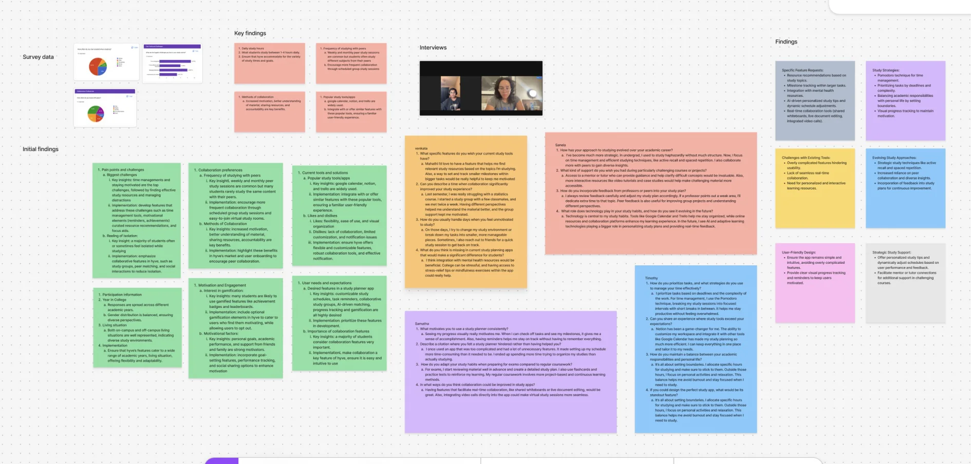
My research board: survey data, interview notes, initial findings and the themes they grouped into.
Where students got stuck
RUN OUT
Motivation comes and goes. With no one checking in, one bad day turns into a lost week.
ALONE
Students do study with peers, but rarely with people in the same classes, so it’s hard to work through the same material together.
OVERLOAD
Planners with too many features take more time to manage than they save.
03 · Key insight
THE HOOK
Students don’t need a better to-do list. They need a reason to come back.
Every finding pointed the same way. Students already make plans; what they lack is a pull back to them on the days motivation is low. So I looked at how habit-forming products bring people back, using Nir Eyal’s Hook model as a frame.
DAILY
LOOP
1 TRIGGER
Inside: academic pressure, loneliness, wanting peers on the same path. Outside: reminders for upcoming sessions, new peer requests, daily goal prompts.
2 ACTION
Join or start a study session, connect with peers, plan the week, track progress.
3 REWARD
Earn points and badges, gain study partners, climb the ranks.
4 INVESTMENT
Building schedules, logging tasks, meeting peers and studying in hubs. The more students put in, the more there is to come back to.
- 1TRIGGERInside: academic pressure, loneliness, wanting peers on the same path. Outside: reminders for upcoming sessions, new peer requests, daily goal prompts.
- 2ACTIONJoin or start a study session, connect with peers, plan the week, track progress.
- 3REWARDEarn points and badges, gain study partners, climb the ranks.
- 4INVESTMENTJoin or start a study session, connect with peers, plan the week, track progress.
My take on the Hook model for Hyve.
From my findings, I concluded:
Inconsistent motivation demands resilient, adaptable habits.
Two questions to design for
01
Stay motivated
How might we create an engaging study platform that helps students stay motivated?
02
Fit the routine
How might we create a platform that slots into students’ routines and builds effective study habits?
04 · What to build
GAME PLAN
Eight ideas, sorted by how much they’d help and what they’d cost.
I listed every feature the research pointed to and placed each one on an impact–effort matrix. The high-impact, low-effort ideas became the first version. Tutor-led hubs and a resource library went on the later list, and AI study tips were cut.
HIGH IMPACT
LOW IMPACT
LOW EFFORT
HIGH EFFORT
BUILD FIRST
LATER
CUT
Redrawn from my FigJam impact–effort matrix.
Four screens, one loop
Home dashboard
REWARD
Progress, streaks and rank at a glance, so every session counts for something.
Peer Connect
TRIGGER
Suggests students taking the same classes. A new request is a reason to open the app.
Planner
INVESTMENT
Plan the week, log study time and check off tasks. Every entry builds on the last.
Study Hubs
ACTION
Join a live session for a class, or start one, in a tap.
Sketching the flow
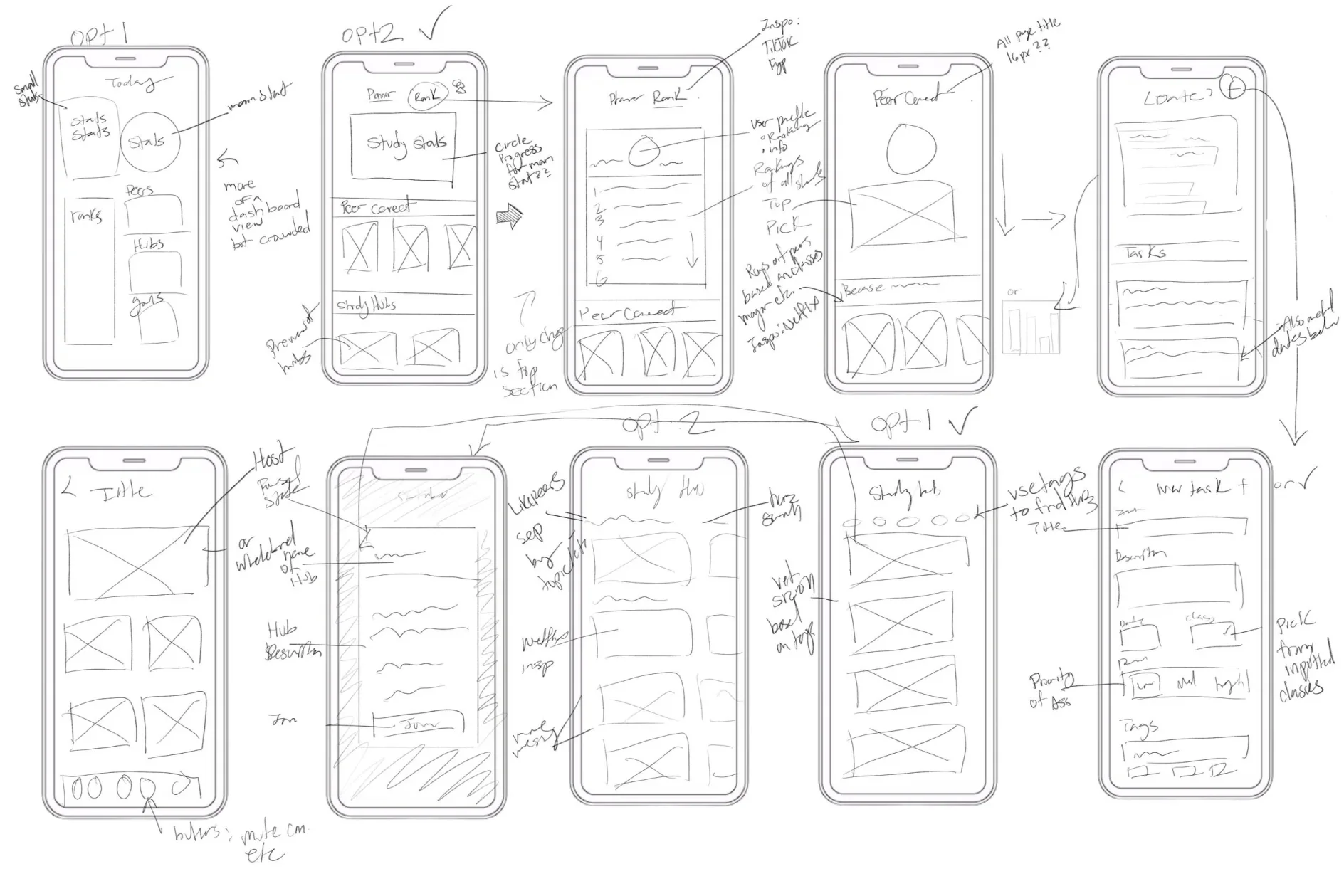
Early concept sketches in Procreate, working out the flow between screens.
05 · Design decisions
THE BUILD
Four decisions, each one traced back to something students told me.
Hyve’s look is light and friendly, but every screen had to earn its place. These are the four calls that shaped the prototype, and what each one cost.
DECISION 1
Lead with progress you can see.
The trade-off
A dashboard full of numbers can bury the one that matters. Minutes, topics, streak and sessions all compete for attention.
What I chose
Tasks left sit in the middle of a progress ring, with the other stats smaller around it. Peer Connect sits right below, so a study partner is one scroll away.
DECISION 2
Make rank a choice, not the default.
The trade-off
Leaderboards motivate some students and stress out others. A separate rank screen would hide it from the people it helps; making it the homepage would push it on everyone.
What I chose
A Progress / Rank toggle on the same card. Your rank, points and the leaderboard are one tap away, and never in the way.
DECISION 3
Keep the planner to one view.
The trade-off
Students already plan in Google Calendar, Notion or Trello, and told me heavy planners get in the way. A lighter planner can’t do everything those tools do.
What I chose
A week strip, study time by class against a daily goal, and the day’s tasks, all on one screen.
DECISION 4
Let students study together, right now.
The trade-off
Live video is the most expensive feature in the app to build. I kept it because real-time collaboration was the biggest gap students saw in their tools; tutor-led hubs waited.
What I chose
Study Hubs for each class, with a live session view that shows who’s in the room and who’s hosting.
Visual design
Harnessing the hive.
I took the look from the app’s namesake. Optimistic yellows and friendly blues carry the warmth and teamwork of a hive, and a honeycomb mark ties it together.
#4A90E2
#5A8FF2
#FFCF27
#FBE158
#E8F3FF
#FFFFFF
#596283
#000000
Aa
Inter, in five weights, for a calm and readable interface at small sizes.

The building blocks
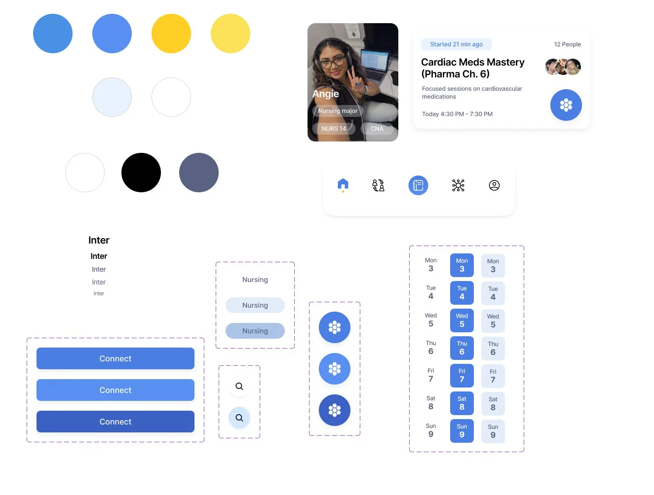
Colors, type, buttons, navigation, cards and the date picker, reused across every screen.
06 · Outcome
NEXT LEVEL
A working prototype, and a clear list of what comes next.
Hyve went from a student survey to a clickable prototype of four connected screens. It hasn’t been built or tested with students yet, so the result here is the design, and a sharper idea of where it needs to go.
STUDYING SOLO
WITH HYVE
Staying motivated
Depends on the day
→
A progress ring, streak and optional rank to come back to
Finding a study partner
Whoever you already know in class
→
Peer Connect suggests students in the same classes
Planning the week
Split across a calendar, notes and a to-do app
→
One view with study time and the day’s tasks
Studying together
Organized over group chat, if at all
→
Join a live Study Hub for the class
Hyve brings together what students said keeps them going: progress they can see, people in the same classes and a plan that stays simple.
What’s next
01
Build out the rest
I designed the core screens and their solutions. Next is the full app, tested end to end with students.
02
Rethink the device
The research pointed to desktop as the better fit for how Hyve’s users study, so a desktop version comes next.
03
Design onboarding
Hyve does a lot at once. Onboarding would introduce features gradually and help students set up a profile that gets them better matches.