Boost is the app San José State students use to order food on campus, and it had a 2.3-star rating. Finding something to eat meant scrolling through every location one by one. I redesigned it so students can find, choose and reorder food in a few taps, then tested it with eight of them.

Project
Boost
Role
Product Designer
Timeline
Oct–Nov 2023
The problem
Students wanted to order food between classes, but Boost buried every option behind slow, cluttered screens.
What I designed
A new home screen, location and menu pages, filters, favorites and a pickup or catering switch.
My role
I ran the research, redesigned the app in Figma and tested it with students.
Where it landed
Every tester finished every task, and all eight found the redesign much easier to use than the current app.
01 · The problem
ONE STAR
Students wanted to grab food between classes. The app made them work for it.
2.3
out of 5 stars on the App Store, from 535 ratings.
San José State students rely on Boost to order from campus dining spots. But muddled categories, confusing labels and nothing to help them decide made ordering slow, and many students gave up on the app altogether.
From a one-star review titled “Actually awful”
“Literally how hard could it possibly be to make an app that actually works?”
The app I started with
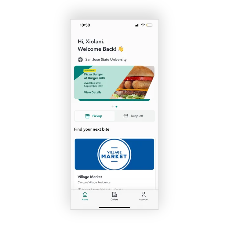
Home
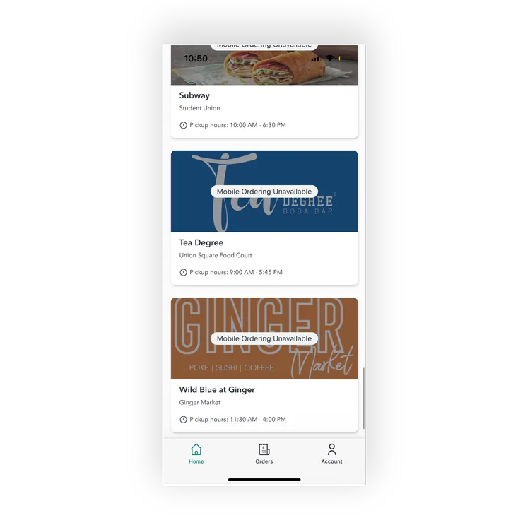
Home Menu
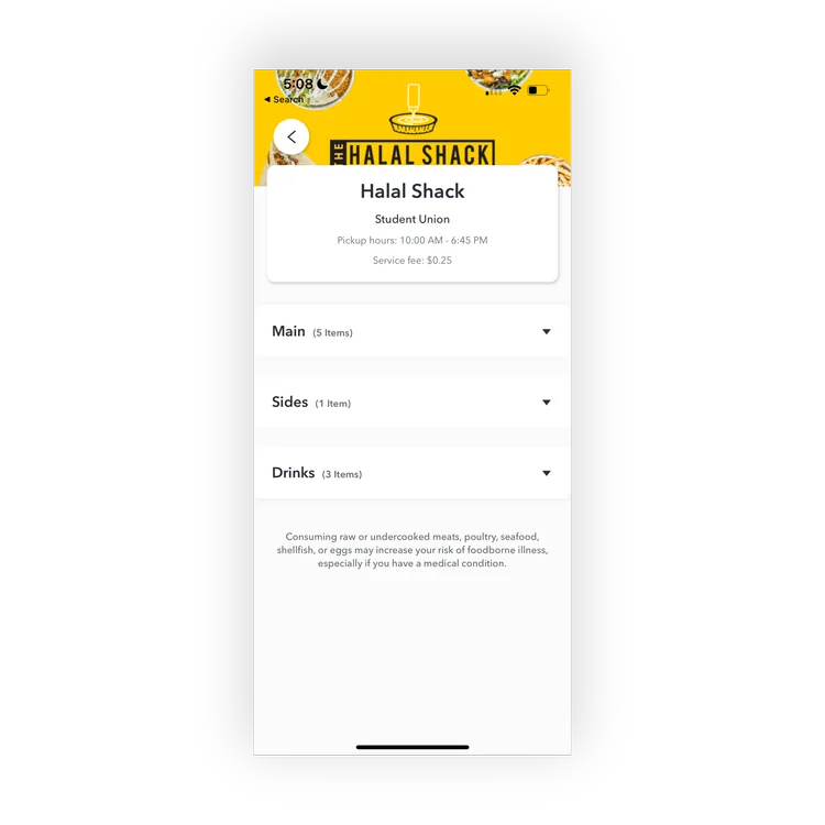
Store menu
Every location listed one by one, and menus that open as plain text lists.
Ordering a snack before class
OPEN
The home screen leads with a promo and a single location.
SCROLL
Every place to eat is listed one at a time, with no filters.
DIG
Menus open as collapsed text lists, with no photos to go on.
GIVE UP
Class starts soon. Back to standing in line.
Pieced together from reviews, interviews and my own walkthrough of the app.
The question I set out to answer
How might we help students find and order food on campus quickly, so the app saves them time instead of costing it?
02 · Research
THE REGULARS
I read the reviews, then asked students what got in their way.
I went through hundreds of App Store and Google Play reviews, then surveyed and interviewed San José State students about how they use Boost and what they’d want from it. I also compared it with the other food-ordering apps students use on campus.
How I worked
01
Research
Review audit
Student survey
Interviews
02
Analysis
Competitive analysis
Personas
03
Ideation
Proposed changes
Sketches
04
Design
Low-fidelity wireframes
High-fidelity screens
05
Testing
Usability tests
Next steps
What students told me
Priya Patel, student
“I liked the idea of Boost, but it didn’t really work out as planned. The interface felt outdated, cluttered, and took too many taps to get to what I needed.”
James Liu, student
“I tried using Boost once when I saw a promo deal for a pizza that I like. The app was straightforward to navigate, but it took a while to load the menu options, which was a bit frustrating because I was in a rush.”
What kept coming up
BURIED
Finding a place to eat meant scrolling through every location, one at a time.
FORGETFUL
The app never remembered favorite or frequent orders.
CLUTTERED
The interface felt crowded and dated, and got in the way of ordering.
BLAND
Without food photos, nothing made students want to explore or order.
How the other campus apps compare
I scored the three food-ordering apps students use most at SJSU from 1 to 5 on what mattered for a quick campus order.
CRITERIA
DINEONCAMPUS
GRUBHUB
TRANSACT MOBILE
Ease of navigation
4
3
4
Filtering options
4
5
3
Finding a location fast
5
3
4
Accurate information
4
3
4
Custom search
3
5
3
Visual clarity
4
3
4
Uses feedback
4
3
3
Campus apps were quickest at finding a location. Grubhub had the best filters of all, but they weren’t built for campus.
Three students I designed for
SOPHIA
The between-classes grabber
20 · Sophomore · Biology · Lives on campus
Juggles labs, a library job and Pre-Med club, with only short breaks to eat.
Needs
Fast ordering and healthy options that are easy to find.
Frustrated by
No filters, and an app that forgets her usual orders.
Built from the interviews and survey.
CARLOS
The commuter in a hurry
21 · Junior · Mechanical Engineering · Commutes 30 min
Doesn’t use Boost yet. Grabs food between classes and loses time in long lines.
Needs
A quick way to find the places he likes and skip the line.
Frustrated by
Cluttered menus and confusing navigation.
EMILY
The indecisive explorer
19 · Freshman · Computer Science · Lives on campus
Uses Boost often but finds it bland and never knows what to pick.
Needs
A visual, easy-to-browse app with recommendations.
Frustrated by
Poor grouping and dated visuals that don’t tempt her to try anything new.
03 · Key insight
THE RUSH
Every extra tap costs time students don’t have.
Across the reviews, interviews and personas, the same complaint kept coming back: it takes too long to find something and decide. Students order in the gaps between classes, so saving time isn’t a nice extra. It’s the whole point.
FIND.
DECIDE.
GO.
From the research, I concluded:
Students take too long to find and decide what they want. Time-saving features are essential to making Boost worth opening.
Three goals for the redesign
01
Remove the pain points students already told me about.
02
Make browsing feel seamless, from the home screen to the menu.
03
Cut the time and effort it takes to find something to eat.
04 · What to build
THE MENU
Seven changes, each one aimed at a complaint from the research.
I listed the changes that would make Boost faster to use and nicer to look at, and kept each one tied to something students had actually said.
WHAT STUDENTS SAID
WHAT I CHANGED
Cluttered and outdated
→
A cleaner, more visual interface with a simple layout.
No quick way to see the order
→
A cart icon at the top of every screen.
Scrolling through every location
→
A search bar on the home screen for places and items.
Nothing looks appetizing
→
Large, high-quality photos of the food.
Hard to decide
→
Popular and recommended items at the top of the home screen.
Pickup or catering? Unclear
→
One Pickup / Catering switch on most pages.
Starting over every time
→
Favorites for go-to orders and locations.
From sketches to wireframes
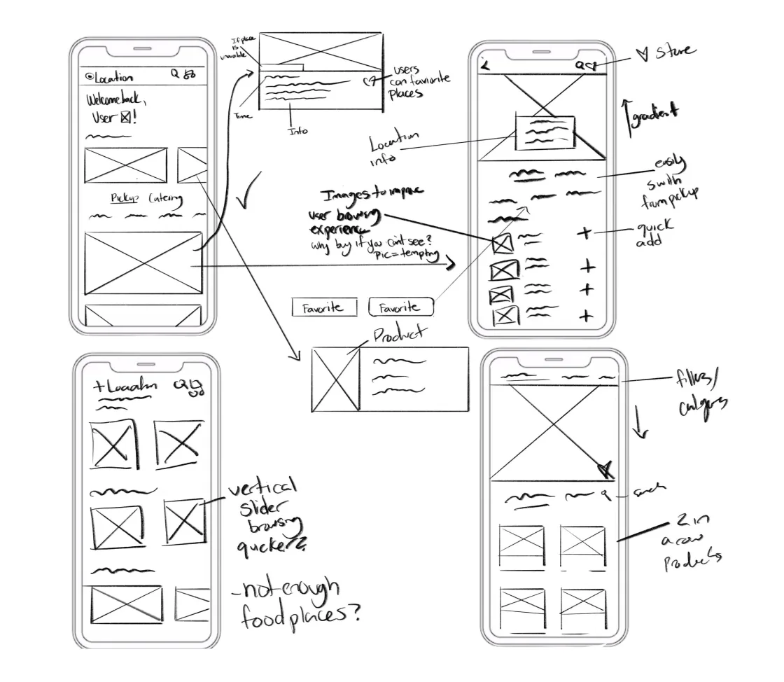
Paper sketches first, weighing different layouts, then grey-box wireframes of the home and store pages.
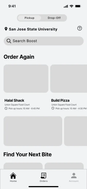
Low-fidelity home
(pick-up)
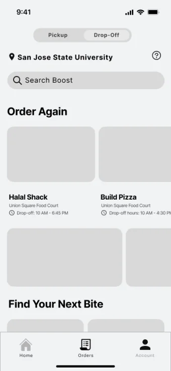
Low-fidelity home
(drop-off)
05 · Design decisions
ORDER UP
Four decisions that turned a slow hunt into a few taps.
Each screen had one job: get a hungry student to the right food faster. These are the calls that shaped the redesign, and what each one cost.
DECISION 1
Lead with quick picks, not a promo.
The trade-off
A row of picks takes the space a promo banner used to fill, and it only helps if the picks are good.
What I chose
Home opens with “Welcome back” and Quick Pick-Me-Ups, popular items students can grab in a tap, with search and the cart always at the top.
DECISION 2
Show the food, not just the names.
The trade-off
Photos make screens heavier to load, and slow menus were already a complaint.
What I chose
Large food photos on every location card, with prep time and pickup hours right under the name, and a heart to save favorites.
DECISION 3
Filter before you scroll.
The trade-off
Every extra chip is another choice on screen. Too many, and the filters become clutter themselves.
What I chose
A short row of chips above each menu, Most Ordered, Favorites and the store’s own categories, so the likely pick is near the top.
DECISION 4
Make pickup and catering one switch.
The trade-off
Catering is a smaller use case, so giving it equal weight could confuse everyday orders.
What I chose
A Pickup / Catering tab on home and store pages. The menu, hours and lead time all change with it.
Visual design
Still Boost, just fresher.
I kept Boost’s teal and orange so it still feels like the app students know, cleared away the clutter, and let the food photos bring the rest of the color.
#037F70
#F59A23
#FFFFFF
#F2F2F2
#1E1E1E
06 · Outcome
TASTE TEST
Every task finished, and every tester preferred the redesign.
I ran usability tests with the Figma prototype to see whether students could get through everyday campus tasks on their own.
100%
task success rate across every test.
8/8
testers found the redesign significantly easier to navigate than the current app.
The tasks
Find the Village Market and its hours
Navigate to the Village Market and check when it’s open.
DONE
Find a snack before class
Browse for something quick using the new filters and food photos.
DONE
Switch Panda Express to catering
Move from pickup to catering, testing the new wording and layout.
DONE
Leading with quick picks, photos and filters turned a slow hunt through every location into a few taps.
What’s next
01
Redesign checkout
Smooth the jump from browsing to paying, with clearer payment options and fewer confirmation steps.
02
Live order updates
Real-time status from preparation to pickup or delivery, with clearer indicators and notifications.
03
Easier customization
A more flexible way to modify meals, with visual cues that make the options simple to read.
04
A design system
Shared rules for type, color, icons and components to keep the app consistent as it grows.