Role
Product Designer
Duration
10/2023 - 11/2023
Scope
Figma, Figjam
Outcomes
Developed a cleaner and more intuitive user interface, improving overall app navigation and visual appeal.
Implemented advanced sorting and filtering features to streamline the search and selection process.
Introduced features like favorites and simplified reordering to personalize user interactions and enhance convenience.
Overview
Friction meets frustration
San Jose State University students are in dire need of an efficient, reliable, and intuitive mobile food ordering platform. Boost’s user experience is hindered by inefficient categorization, confusing labeling, and a lack of encouraging elements that motivates users to make purchases. This has led to a decreased satisfaction and frequent abandonment of the app.
Users are not happy…
Goals
Removing known pain points,
implementing a seamless browsing experience process.
Reduce time and effort needed to browse the Boost mobile app.
Approach
Research
Along with going through hundreds of App Store and Google Play reviews, I surveyed and interviewed SJSU students to find out their issues with Boost mobile, and what they would like to see in the app.
Users are reporting that it takes them too long to find and decide what they want. Time saving features are essential to improving the Boost’s user experience.
Old UI:
General feedback received:
Users are finding it difficult to quickly locate and choose dining options, as they must scroll through each location individually to find their desired place to eat.
Users indicated a need for an easy way to access frequently/favorite orders.
Current interface is cluttered and outdated, detracting from the ordering experience.
Lack of engaging visuals/images fails to inspire users to explore and place orders.
Exploring the landscape
Conducting a competitive analysis of the leading food-ordering apps at SJSU, I assess factors like navigation ease, filtering options, and search efficiency to identify strengths and opportunities for improvement in the campus dining context.
Analyzed and compared leading campus food ordering brands at SJSU
Crafting Personas
Using the data collected by users interviews and surveys, I created user personas to better understand the wants and needs of our users.
Proposed Solutions
Proposed SolutionsBased on the research findings and user feedback, the following solutions were identified to enhance the Boost app’s usability and overall user experience:
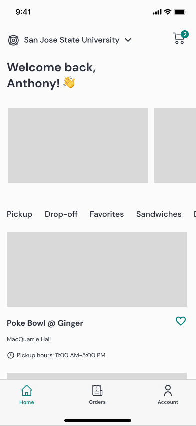
A modern, visually appealing interface with an intuitive layout to reduce clutter and improve navigation.
A persistent cart icon at the top of the screen allows users to easily access and review their orders without navigating away from the menu.
A prominent search bar on the homepage helps users quickly find specific dining locations or menu items without excessive scrolling.
High-quality images of food items to visually engage users and make browsing more enticing.
A dedicated section at the top of the homepage showcasing popular or recommended items, encouraging exploration and quick decision-making.
A streamlined option to switch between pickup and drop-off throughout most pages, reducing confusion and allowing users to seamlessly choose their preferred method of receiving their orders.
A feature allowing users to save and quickly access their favorite orders or frequent locations, making the app more personalized and time-efficient.
Design
Low-Fidelity Wireframes
Keeping the pain points, interviews, analysis, and personas in mind, I began to sketch out the layout of the pages. Weighing different formats, understanding which one best fits Boost’s users.
High-Fidelity Wireframes
In this phase, the focus was on refining the interface for visual clarity and consistency, ensuring that each interaction supports seamless navigation and enhances core functionalities like browsing, product selection, and order recommendation.
Prototypes
Users can smoothly explores a curated selection of enticing food options, designed to simplify decision-making with eye-catching visuals.
Discover Suggested Delights
2. Save Your Go-To Eats
Users can quickly favorite their top meals and locations for fast, one-tap reordering.
3. Filter and Buy with Confidence
The enhanced filter system, combined with high-quality product images, encourages users to browse meals more easily, making it more visually engaging and motivating for them to place an order.
Usability Testing
We conducted a series of usability tests using the Figma mobile app prototype to evaluate the ease of navigation and overall user experience in the redesigned Boost UI. The primary objective was to assess whether users could easily perform specific tasks that reflect common use cases on campus.
The tasks included:
Locating the Village Market and Finding Their Hours: Participants were asked to navigate the app to find the Village Market and check its operating hours.
Finding a Pre-Class Snack: Users were tasked with browsing the available food options to select a quick snack before class, utilizing the new filtering options and product visuals.
Switching from Panda Express Pickup to Catering: Participants explored the updated interface to seamlessly switch between ordering for pickup and catering from Panda Express, testing the clarity of the new terminology and layout.
100 %
Task success rate
8/8
Found the redesigned Boost UI significantly easier to navigate than the previous version.
Next Steps
Redesigning the Checkout Experience: We will streamline the checkout process to reduce friction, ensuring a smoother transition from browsing to payment. This will involve improving clarity on payment methods, optimizing the confirmation steps, and making the checkout process faster.
Enhancing Order Updates: We plan to revamp the way users receive order updates, providing real-time, dynamic updates on their food orders. This will include clearer status indicators and notifications to keep users informed about their order progress from preparation to pickup or delivery.
Designing the Customization Process: We aim to create a more intuitive and flexible food customization feature, allowing users to modify meals more easily. This includes adding visual cues and interaction points that make customizing options simple and visually engaging.
Improving the Design System: To ensure long-term consistency and scalability, we will refine the design system across the app, establishing clear guidelines for typography, color schemes, iconography, and component libraries that enhance the overall user experience.


